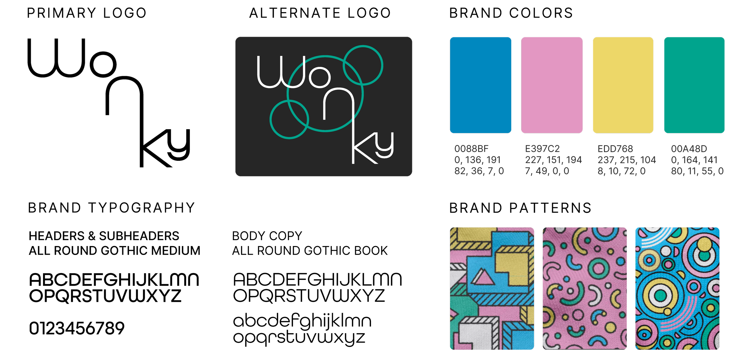
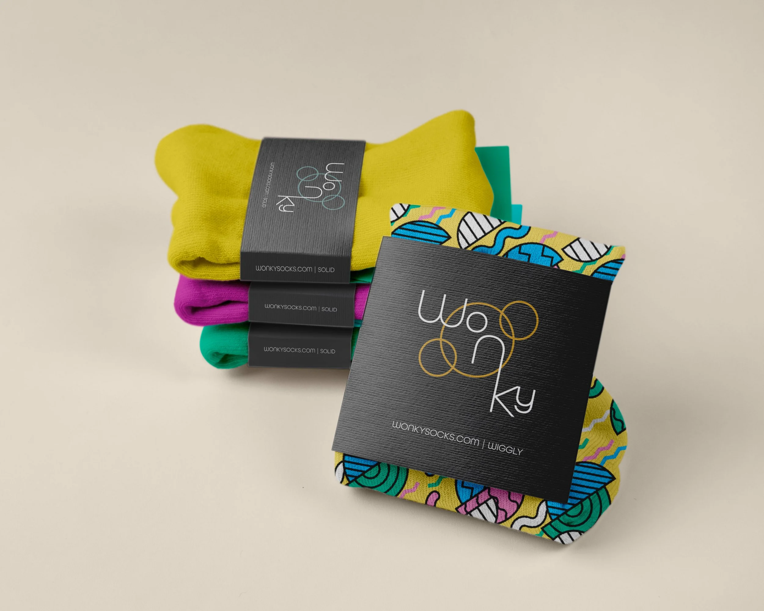
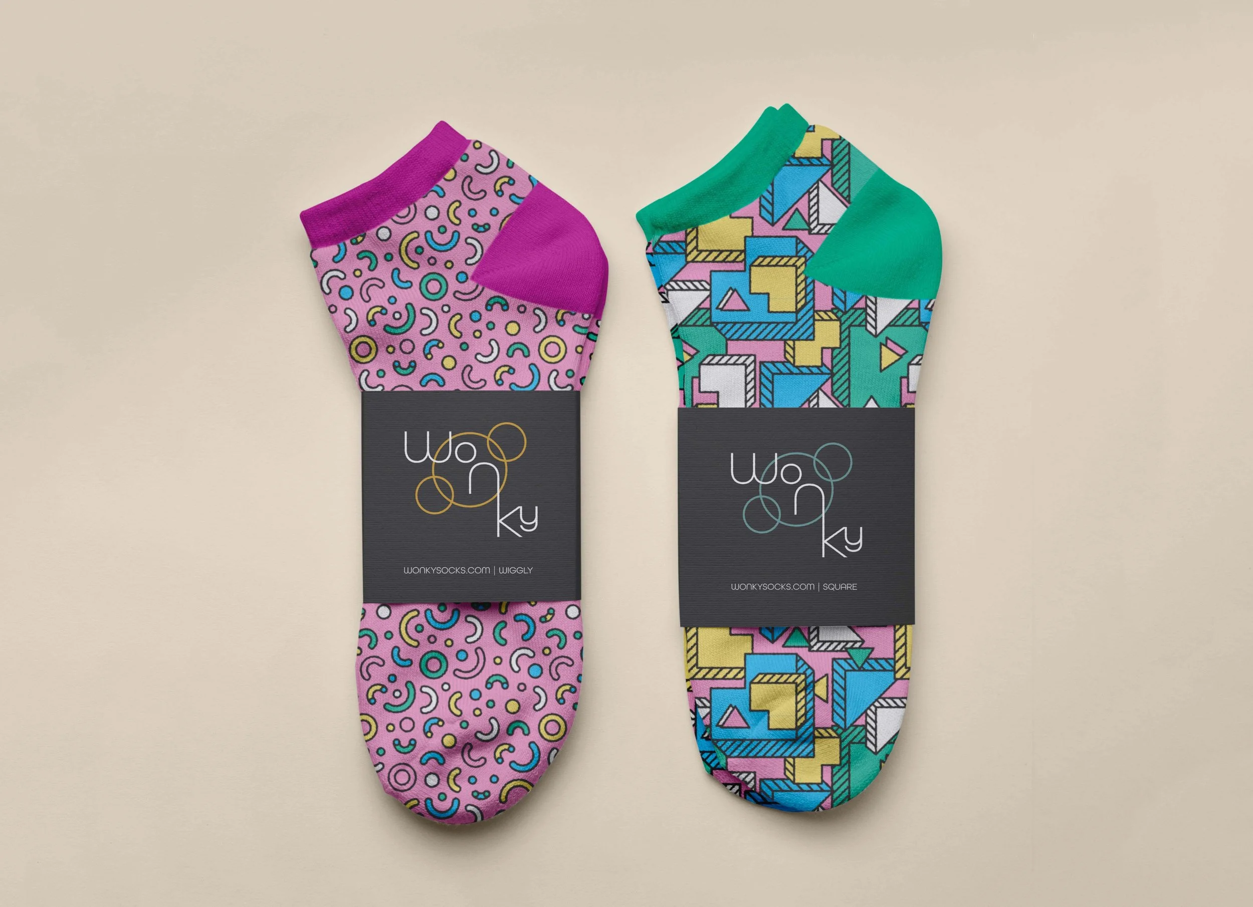
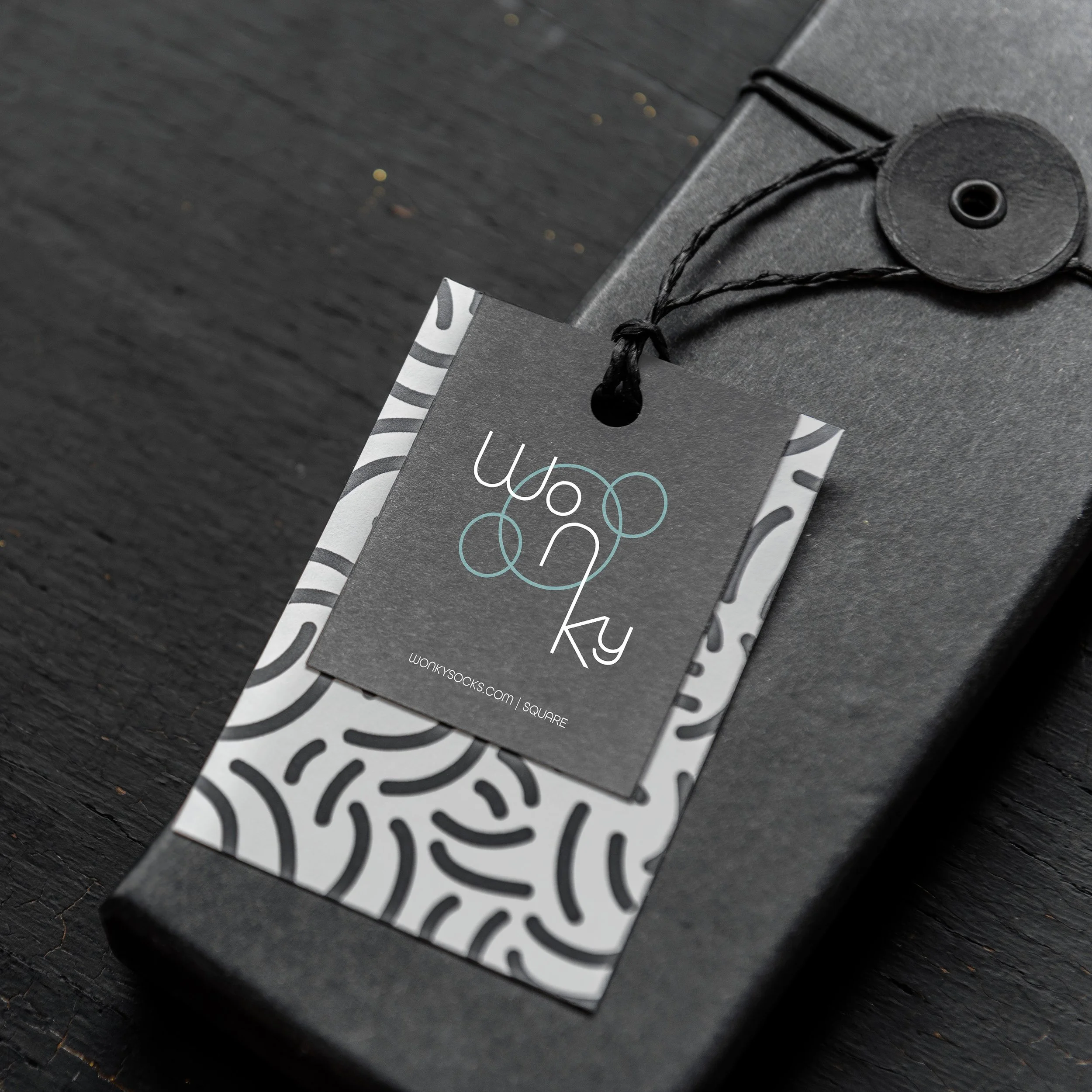
The word WONKY means crooked, off-center, or askew. It can also describe something shaky, unsteady, or delightfully out of the ordinary. This playful definition became the inspiration behind the logo design. By placing each letter on a different baseline, the typography visually captures the meaning of the word while maintaining a cohesive, recognizable identity. After all, aren't we all a little wonky sometimes?
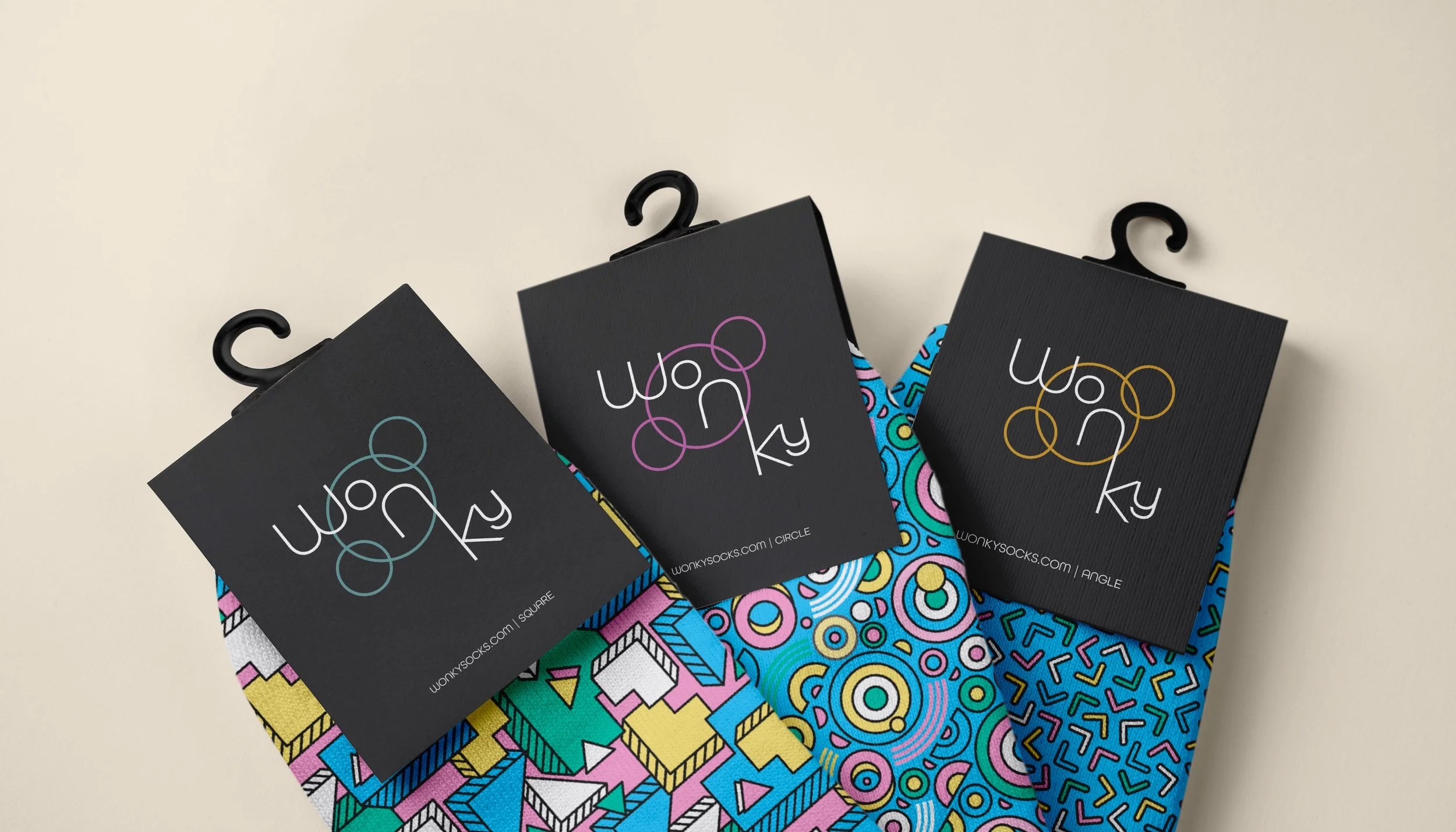
The vision for the brand is to create a fun, colorful, and expressive sock line for all ages, celebrating individuality, personality, and the beauty of being a little different.